Free Weather Updates in iCal

If you would like free weather reports in Apple’s iCal (which can be synced to your iPhone or iPod Touch), there’s good news: Weather Underground supports the iCal .ics format as a subscription format. (It also offers RSS.) And unlike the shareware application WeatherCal (which provides the same service), it is free.

What this means is that you can subscribe to weather reports for any city, and have the forecast appear within iCal. The 7-day forecast will display as a series of all-day events in the calendar. (All-day events appear as headers at the top of each day.) Weather details older than one day are automatically deleted, which is nice; it doesn’t fill up your calendar.

Here in an example page from Weather Underground, and the steps to get the forecast into iCal:
http://www.wunderground.com/cgi-bin/findweather/getForecast?query=stl&wuSelect=WEATHER

This happens to be the page for St. Louis, Missouri. You can change the city to whichever one you want. In the upper-right, you will see the ICAL and RSS links. Clicking the ICAL link will download a file; that is not really what you want. If you right-click (or control-click) on the ICAL link, and choose the option to copy it, you can then switch to iCal, choose “Subscribe…” from the Calendar menu, and paste the address you copied. In iCal, right-click (or control-click) on the new calendar, and choose “Get Info.” Make sure the option to Auto-Refresh is set to “Every day.” Then you will get a handy 7-day forecast, unlike WeatherCal’s 5-day forecast.
Calibration Wallpaper

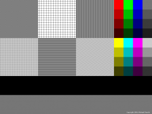
Back in 2001, I created this wallpaper image to test monitor color and scan-line accuracy. Although more useful with CRT monitors, I suppose it may have some value to those who are trying to diagnose any kind of display problem.

You can download the wallpaper by clicking here:

Notes on usage:

  • Be sure to download the full-size wallpaper, not the preview image above. The size is 1024×768.
  • Set the wallpaper as your desktop wallpaper / background image.
  • However, DO NOT STRETCH OR SHRINK THE IMAGE. In your desktop wallpaper settings, be sure any option to scale/resize/stretch the desktop image is OFF. It is okay if the image floats in the middle of your screen. If you have empty space around the image, it is advised that you change the color of the screen to black or a neutral gray.

What you are looking for:

  • On the right are color swatches. The top ones are shades of pure red, green, and blue (the primary colors of RGB monitors), as well as neutral gray. The bottom ones are yellow, cyan, and magenta, which are the secondary hues made from various 100% combinations of the RGB primaries. Make sure the colors look right, and grays have no color cast.
  • The main part of the wallpaper is six large patches filled with various patterns. These help you catch moire patterns, crooked scan-lines, scaling issues (if you are not using your screen’s native resolution, for example), and so forth.

Descriptions of pattern tiles, left to right, top to bottom:

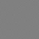
  • Fine dots. Should appear an even gray. If you see something like the image below, instead, your display has moire or scan-line problems. Check if your monitor has a menu for geometry settings, and if you can fix the problem there.

  • Field of plus signs. Lines should be broken vertically and horizontally. Gap size is one pixel. If you don’t see the gap, either there is image bleeding, or there is a scaling issue (non-square pixels). Additionally, the grid cells should appear perfectly square, not rectangular.
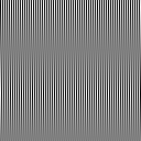
  • Vertical lines. Should appear an even gray from a distance. If you are short-sighted, try removing your glasses and viewing your display from a few feet away; the top-right, top-left, and lower-center tile should all appear the same shade of gray. If you see bands, like in the image below, your display has geometry problems.

  • Field of light dots. Similar to fine dots, above.
  • Horizontal lines. Works the same as vertical lines, above.
  • Zig zag lines. Should appear as a horizontal herringbone pattern. (To be honest, I couldn’t think of any more patterns, so I just put that one in there for kicks.)

Schedule Time Machine Backups

One thing I like about Apple’s OS X 10.5 (Leopard) is the built-in Time Machine backup software. I purchased a Time Capsule backup drive to go with it. Although the system apparently works well — I haven’t had to restore anything yet — it is quite slow, and by default runs every hour. It seemed that every time I wanted to log out, restart, or shut down my computer, it was in the middle of a backup.

Unfortunately, Time Machine does not include any settings to control the frequency of backup. Fortunately, changing how often backups occur is not hard to do. There are basically three routes you can take; they all do precisely the same thing (change a particular configuration file):

  • Use a freeware application called Time Machine Editor
  • Use a freeware application called Lingon to edit the necessary file (this is the way I did it; however, Lingon is a powerful program that, used improperly, can totally trash your system, so beware; this is similar to using regedit in Windows)
  • Navigate to /System/Library/LaunchDaemons/com.apple.backupd-auto.plist and edit the file manually according to instructions here

JES Deinterlacer

As a graphic designer at a television network, one of my frustrations is the quality of graphics that are pulled from video. Not only are they small in pixel dimensions, but they also suffer from interlacing.

This is where JES Deinterlacer comes in. This Mac-only application takes a video (NTSC, PAL, and other formats), and processes it to remove the interlacing. The result is a cleaner image.

There are at least two benefits to using this application:

  1. You get cleaner stills, without the blur effect seen in interlaced images (see examples below).
  2. You can use the de-interlaced video to create cleaner video for non-interlaced video formats, such as YouTube, podcasts, and just about any digital video format.

I’ve had great results with this application, and highly recommend it.

Here are some practical examples:

Exhibit 1 (top image is interlaced, bottom image is de-interlaced; click to enlarge to actual size):

C.A. Murray 1 - Interlaced
C.A. Murray 1 - De-interlaced


Exhibit 2 (note especially his hand in the foreground):

C.A. Murray 2 - Interlaced
C.A. Murray 1 - De-interlaced