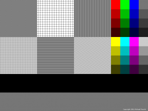
Back in 2001, I created this wallpaper image to test monitor color and scan-line accuracy. Although more useful with CRT monitors, I suppose it may have some value to those who are trying to diagnose any kind of display problem.
You can download the wallpaper by clicking here:
Notes on usage:
- Be sure to download the full-size wallpaper, not the preview image above. The size is 1024×768.
- Set the wallpaper as your desktop wallpaper / background image.
- However, DO NOT STRETCH OR SHRINK THE IMAGE. In your desktop wallpaper settings, be sure any option to scale/resize/stretch the desktop image is OFF. It is okay if the image floats in the middle of your screen. If you have empty space around the image, it is advised that you change the color of the screen to black or a neutral gray.
What you are looking for:
- On the right are color swatches. The top ones are shades of pure red, green, and blue (the primary colors of RGB monitors), as well as neutral gray. The bottom ones are yellow, cyan, and magenta, which are the secondary hues made from various 100% combinations of the RGB primaries. Make sure the colors look right, and grays have no color cast.
- The main part of the wallpaper is six large patches filled with various patterns. These help you catch moire patterns, crooked scan-lines, scaling issues (if you are not using your screen’s native resolution, for example), and so forth.
Descriptions of pattern tiles, left to right, top to bottom:
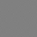
- Fine dots. Should appear an even gray. If you see something like the image below, instead, your display has moire or scan-line problems. Check if your monitor has a menu for geometry settings, and if you can fix the problem there.

- Field of plus signs. Lines should be broken vertically and horizontally. Gap size is one pixel. If you don’t see the gap, either there is image bleeding, or there is a scaling issue (non-square pixels). Additionally, the grid cells should appear perfectly square, not rectangular.
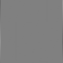
- Vertical lines. Should appear an even gray from a distance. If you are short-sighted, try removing your glasses and viewing your display from a few feet away; the top-right, top-left, and lower-center tile should all appear the same shade of gray. If you see bands, like in the image below, your display has geometry problems.

- Field of light dots. Similar to fine dots, above.
- Horizontal lines. Works the same as vertical lines, above.
- Zig zag lines. Should appear as a horizontal herringbone pattern. (To be honest, I couldn’t think of any more patterns, so I just put that one in there for kicks.)
